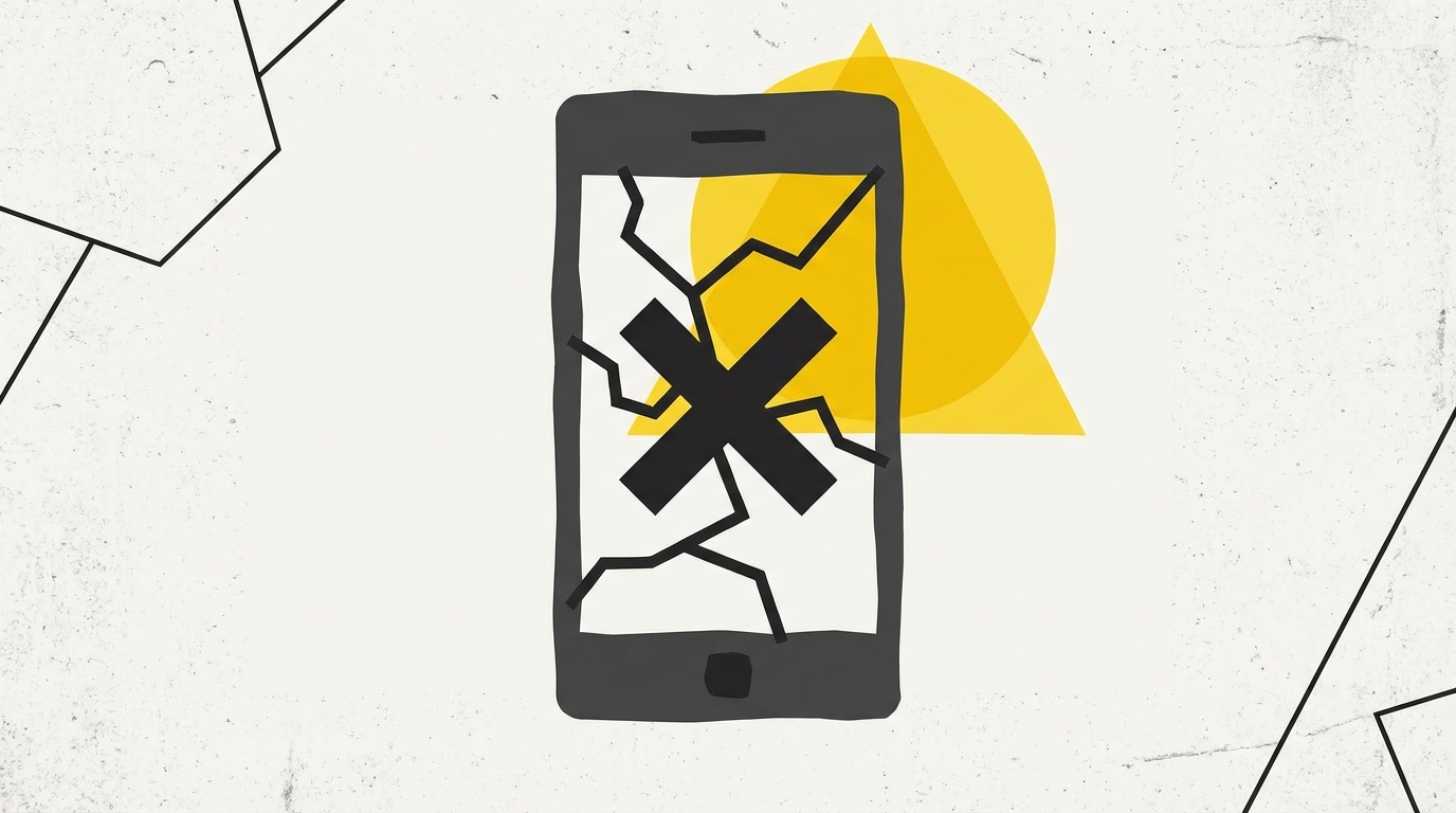
Mobile Website Mistakes That Kill Malaysian Businesses
So, your website isn’t bringing in the customers you hoped for? In Malaysia, where over 70% of internet traffic comes from mobile devices, a bad mobile website experience is basically throwing money away. We see it all the time with Johor Bahru SMEs: beautiful desktop sites that are practically unusable on a phone. Let’s look at some common mobile website mistakes that are costing you business and what you can do about it.
Slow Loading Speeds: Losing Customers Before They Arrive
Malaysians are impatient. We’re used to Grab deliveries appearing in minutes and instant messaging on WhatsApp. If your website takes more than 3 seconds to load on mobile, you’re losing potential customers. Every extra second is a drop in your conversion rate. Think about it: are you going to wait for a slow page to load when you can just Google another option?
- Test your website speed: Use tools like Google’s PageSpeed Insights to check your mobile loading time.
- Optimize images: Large image files are a major culprit. Compress your images before uploading them to your website.
- Consider a Content Delivery Network (CDN): CDNs distribute your website content across multiple servers, so users can access it from a server closer to them, speeding up load times.
- Don’t rely on shared hosting if you’re serious: Shared hosting can be slow. It might be time to upgrade.
Our sites at GX Automation load in under 1 second because we prioritize performance from the ground up. No bloated WordPress themes, just clean, optimized code. We can even show you how your current site performs with our free website audit tool: /audit
Tiny Text and Unclickable Buttons: The “Squint and Pinch” Experience
Nothing is more frustrating than trying to read tiny text or tap on a button that’s too small on a mobile screen. This leads to a terrible user experience, and users will quickly bounce away from your site.
- Use a responsive design: This ensures your website adapts to different screen sizes. A good responsive design adjusts text size, image sizes, and layout automatically.
- Make buttons and links easy to tap: Aim for a minimum touch target size of 48x48 pixels. Imagine trying to tap a button with a satay stick - that’s the experience you want to avoid!
- Use clear and concise language: Mobile users are often on the go. Get to the point quickly and avoid long paragraphs.
We focus on mobile-first design principles. This means designing for mobile first and then scaling up to desktop, not the other way around. Check out some demo features on our /showroom page.
Ignoring WhatsApp: Missing Out on Direct Communication
WhatsApp is HUGE in Malaysia. It’s how we communicate, how we shop, and how we do business. If your website doesn’t integrate with WhatsApp, you’re missing out on a massive opportunity.
- Add a WhatsApp button to your website: Make it easy for visitors to contact you directly via WhatsApp. Place it prominently on your homepage and contact page.
- Use WhatsApp for customer support: Respond to inquiries and provide customer support directly through WhatsApp.
- Consider WhatsApp automation: Automate responses to frequently asked questions and qualify leads. This can save you time and improve customer service.
At GX Automation, we offer comprehensive /solutions/whatsapp-automation solutions. From simple WhatsApp buttons to advanced chatbot integration, we can help you leverage the power of WhatsApp to grow your business.
Hidden Navigation and Cluttered Layouts: Making it Hard to Find What They Need
Mobile users need to be able to easily navigate your website and find the information they’re looking for. A cluttered layout and hidden navigation will only frustrate them.
- Use a clear and concise menu: A simple hamburger menu (the three horizontal lines) is a common and effective way to hide the navigation on mobile.
- Prioritize key information: Put the most important information at the top of the page. Think about what users are most likely to be looking for and make it easy to find.
- Use white space effectively: Don’t cram too much information onto one page. White space helps to break up the content and make it easier to read.
- Don’t let popups kill the experience. Ensure any popups are mobile-friendly and easy to dismiss. Aggressive popups on mobile are a surefire way to annoy your visitors.
Not Having a Clear Call to Action: Leaving Customers Without Direction
What do you want visitors to do when they land on your website? Make it clear with a strong call to action. Whether it’s making a purchase, filling out a form, or contacting you via WhatsApp, tell them exactly what you want them to do.
- Use action-oriented language: Use verbs like “Buy Now,” “Get a Free Quote,” or “Contact Us Today.”
- Make your call to action visually prominent: Use a button with a contrasting color to make it stand out.
- Place your call to action in a strategic location: Consider placing it above the fold (the part of the page that’s visible without scrolling) or at the end of a sales pitch.
Fixing these mobile website mistakes doesn’t have to break the bank. We offer high-performance websites for Malaysian SMEs starting from RM 2,688. We provide a one-time payment model (no monthly fees!) which is why our clients see us as a valuable investment in their business. You can see our /pricing for the full details.
Ready to take your mobile website to the next level? Contact us on WhatsApp today for a free consultation: https://wa.me/60169383640
Ready to Automate Your Business?
Let's talk about how we can help your business grow.